
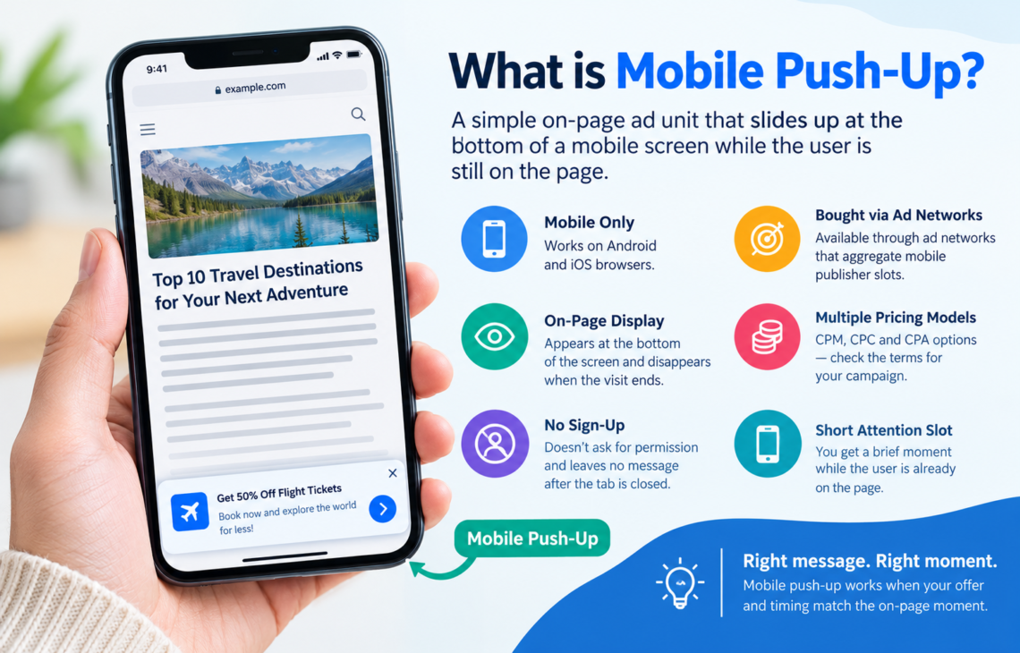
Many buyers confuse two products that share the word push. This guide covers mobile push-up units that slide up as small notification-style boxes at the bottom of a mobile web page while the person is still on that page. There is no sign-up and no message after the tab is closed, so they earn a test when your offer and timing match that on-page moment.
What mobile push-up is and how it differs
Subscription push and mobile push-up share a look but not a delivery path. Subscription push asks for permission first and can return later. Push-up appears while the page is open and disappears when the visit ends.
Think of push-up as an on-page notice at the bottom of the small screen where thumbs already rest. It is mobile-only and renders in mobile browsers on both Android and iOS, though you still need to test the experience on each system. You buy it through ad networks that aggregate mobile publisher slots. The linked provider lists CPM, CPC and CPA pricing for Mobile Push-Up. Compare the terms available for your campaign: impression billing, click billing and action billing allocate cost differently. A listed pricing option does not guarantee eligibility for every offer.
Delivery is tied to the visit itself.
That limit shapes the buying approach. You can’t send another notice after someone leaves or rely on an owned subscriber list. You get a short slot while attention is already on the screen. If your message and next page don’t fit that slot, another format may suit you better.
Buyers who expect subscriber behavior set the wrong goals for push-up. The ad cannot return after the visit ends, but someone who clicks can still convert later. Read early clicks alongside subsequent actions rather than treating the end of the publisher visit as the end of the conversion window.
When this format fits your goal
Push-up can fit offers with a straightforward next step. Trials, downloads, short sign-ups and price checks are candidates because the action after the click can be relatively simple. If the user can assess the offer comfortably on a phone, the bottom-screen slot may be enough to earn interest.
Volume is the second test. Push-up is sold across many mobile placements and can deliver a lot of views in a short time. That helps when you need results quickly and judge by cost per action rather than recall. In performance and affiliate campaigns, this makes the format worth considering when speed matters more than a long nurture sequence. With a clear payout and a focused page, volume can produce useful learning.
Phone behavior matters too. A large share of browsing happens on small screens, where a notice is within easy reach. A unit near the thumb can offer a less disruptive entry than a new tab or a heavy banner. Inspect whether the actual unit overlaps text, navigation or consent controls. A bottom-screen placement can leave the article visible, but does not automatically avoid obstruction on every phone.
Match the math before you run. You need a payout that can absorb the cost of traffic and a page that turns a share of clicks into actions. If the margin is thin and each sale needs many touches, push-up may struggle to carry it. If a manageable batch of taps can support a worthwhile test, it’s worth a slot in the mix.
When to skip it for now
Some sales need proof and time. High-ticket services and complex software trials can involve documents and calls. A notice that lives for seconds on one page can’t build that trust alone. Consider search or content where the buyer has more room to compare and return.
Support load is another filter. If every conversion needs live chat or a phone conversation to close, running ads when no one can answer may waste the opportunity. Poor timing here can burn spend and trust at once.
For a longer research cycle, consider what happens after the initial click. The unit cannot provide off-site reminders, but the destination can support further reading and a later return. Account for those delayed actions within an appropriate attribution window. Compare the economics with search and content before choosing a channel.
There’s no shame in waiting. Tighten the page and clarify the payout before you buy views. A delayed test with a ready path beats a fast test that leaks.
If answers lag, shorten the test window to staffed hours and note the change in your log. You can widen hours later once support grows.
How push-up compares to pop and other mobile formats
Pop and push-up often share a media plan but feel different to the user. Pop opens a new tab over or under the current page and presents a full page view. Push-up stays inside the same view as a small box at the bottom. That is a different interruption, not automatically a gentler one. Assess obstruction, dismissal and response in the actual mobile implementation.
Native teasers blend into feeds and need strong headlines to earn a pause. Banners sit in fixed slots and fight banner blindness on small screens. For buyers who want a notice-style look without subscriber logic, ad networks that sell mobile push ads explain the format, delivery and buying models in one place. Pop offers broad reach through a full-page opening. Push-up offers a smaller on-screen moment that keeps the current page in view.
Cost logic follows attention. Pop can be cheaper per thousand, yet quality varies widely by placement. Push-up taps involve a choice to interact with a visible box, though that alone does not establish conversion quality. Neither is better in all cases, and separate tests make the differences easier to judge.
Affiliate networks and direct advertisers often run both to cover different opportunities. They use pop for broad sweeps and push-up for notice-driven taps that stay in context. Keep budgets and trackers apart so you know which format and placement led to each action.
How to structure a fair test
Start narrow and keep variables low. Pick one geo cluster where language and daily habits match so timing is easier to interpret. Stick to mobile phones and leave broad device settings open inside that cluster. Run one offer and one landing path per source so results don’t blur. Add a second source only when the first setup tracks cleanly.
Budget for learning rather than expecting profit on day one. Set aside enough to buy a readable batch of clicks that can yield a handful of actions if the page converts. Split that learning budget evenly when you test two sources side by side. Evaluate each source against the agreed acquisition-cost goal after allowing for reporting lag and sample uncertainty. Pause immediately for broken destinations or spending outside the approved limit; a flat trend alone is not a reason to stop a profitable source.
Tracking must be in place before spend starts. Place a conversion pixel on the thank-you step and test it with a live click. Pass source and placement IDs through to your tracker so later cuts are possible. Without that link from tap to action, click rate can mislead you.
Resist tight filters at the start. Carrier and browser trims can wait until you see a base rate, since early cuts may hide winners and leave too little traffic to judge.
Document every change. Note bids and dayparts so later results tie back to a cause. Clear notes beat memory when two sources perform differently.
Hold bids steady while you test timing. Bid shifts make it harder to tell whether the hour or the price affected results.
Creative and landing page setup that holds up
Small boxes need plain words. Lead with what the user gets and what to do next. Keep the title short enough to read at a glance and pair it with a clear image that matches the offer. Avoid promising one thing and landing elsewhere, because that mismatch can waste the click.
Test angles as well as colors. Write a few variants around price, speed, ease and access rather than swapping backgrounds alone. Keep the landing headline tied to the advertised promise. If the ad offers a free check, the page must provide that check under clearly disclosed conditions. Exact repetition is less important than an accurate, understandable connection. That consistency gives people less reason to doubt the offer.
Speed matters on phones. Compress images and remove unnecessary heavy scripts to keep the pre-lander quick on mid-range devices. Follow a one page, one action approach where it fits, removing side links that distract from the next step. Keep enough detail for someone to understand what they are agreeing to.
Match the promise end to end. Use the same promise from ad to page in the headline and button text. One clear button can make the next step easier when attention is limited.
Keep the pre-lander light and honest. A short page may suit a simple offer, while others need more explanation before the button. Load fast and state terms plainly.
When to run the test and how to judge it
A campaign schedule controls when you are eligible to buy the available placements; it does not turn push-up into an off-site message. The unit appears during a publisher-page visit that serves the slot. Your schedule therefore needs to account for publisher traffic in the target area. Mornings and evenings may bring more page views as people check phones before and after work. Include those periods where relevant, but judge the schedule by results in local time rather than assuming a universal peak.
Offer hours matter as much as traffic hours. Some flows need an open cart or a team on shift. If no one can fulfil or answer, clicks after close may go to waste. Run the bulk of the test when the full path from tap to fulfilment is available.
Keep test windows comparable across sources. Start and pause at the same local hours so the weekday and weekend mix does not skew one side. Give each source comparable days and dayparts. Account for audience and delivery differences too; matching schedules alone does not make the sources equivalent.
Allow for lag before you cut. Mobile actions can land minutes after the tap while users compare or wait for a code, and some conversions take longer. Don’t pause a placement in hour one because actions have not caught up yet. Review by placement and device first, then look at geo slices separately. Keep winners on a short whitelist and park losers on a blacklist for the next round.
Scale in steps. Add budget to whitelisted placements before you open new geos. Open one new cluster at a time so you can assess whether the timing lessons carry over.
Push-up needs an offer and timing that suit the on-page opportunity. Pick a straightforward next step and test it across relevant local hours. Let placement results guide the next move.